Hi Flashbots collective ![]()
I’m deadpine, a designer working with the Flashbots team on a redesign for this forum. I want to share what we’ve done so far and open a conversation to gather feedback.
Our goal for this project is to make the forum more intuitive to use. We want to bring attention to the important parts and minimize distractions. In addition, we’re updating the overall aesthetics to ensure a consistent design with the Flashbots website.
Here is a list of changes we’ve made:
-
Created a new theme. Inspired by LaTeX formatting and our website, the theme includes:
-
Color schemes for both light and dark modes.
-
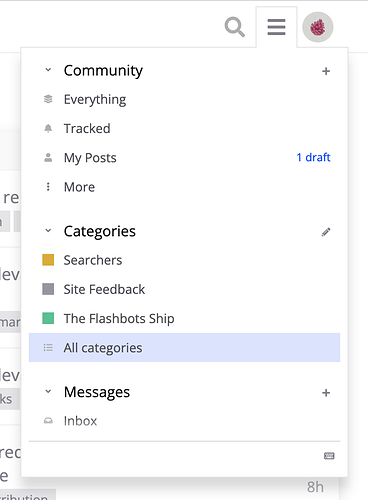
A lighter navigation design:
-
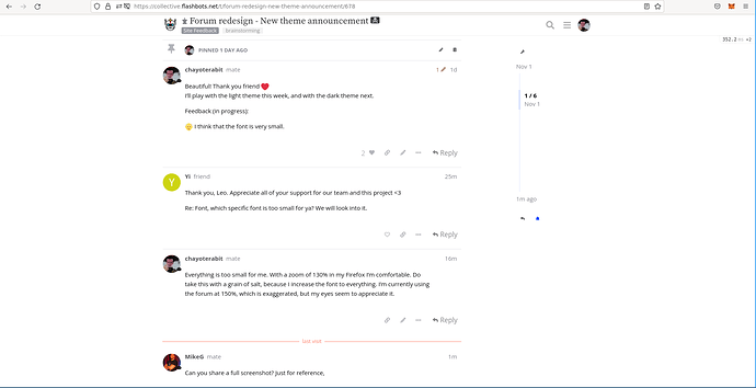
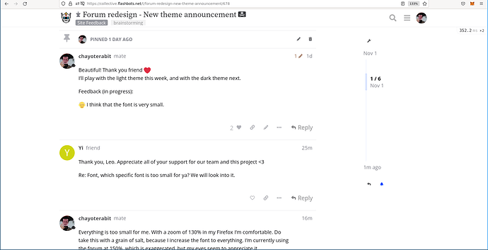
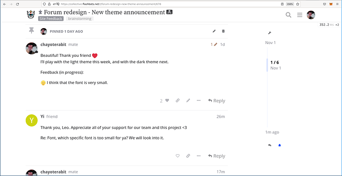
Font updates. We added a new (serif) font for headings and changed the paragraphs slightly to improve their readability:
-
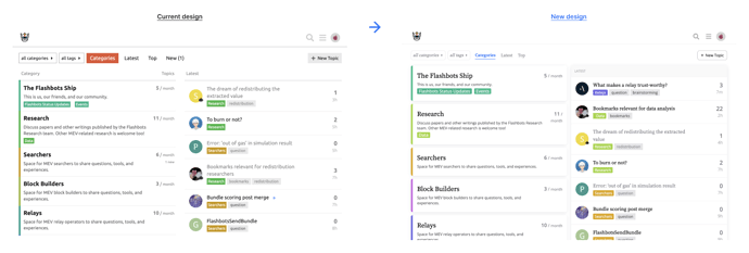
A cleaner landing page with separate cards for each category:
-
A new design for the “Latest” and “Top” pages:
-
Rounded corners and new colors for buttons:
-
Rounded corners for containers:
-
-
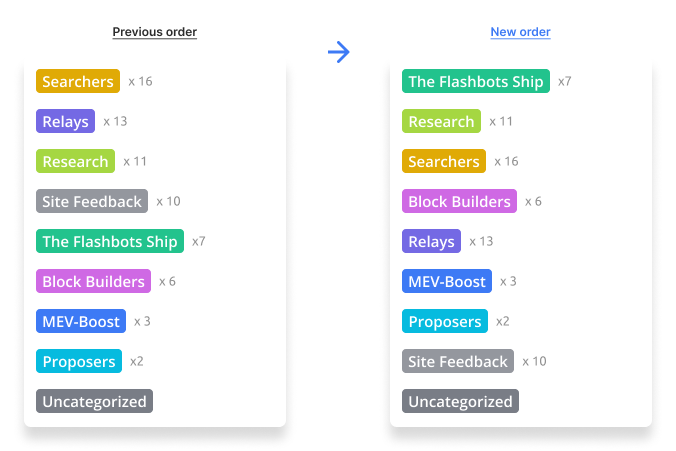
Reordered the Categories. Categories are now fixed in place instead of sorted by activity. We’ve also updated the category colors and replaced the bullets with a solid background to increase visibility.
-
Moved the sidebar. We moved that information and settings to a menu next to your profile picture.
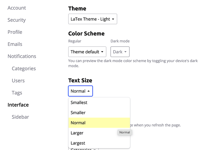
The new theme is live if you want to explore it. You can switch to the new theme by going to: User preferences → Interface → theme → LaTeX theme (dark or light)
Looking for feedback 
We are all part of the Flashbots ship and care about your thoughts. Let us know if you have any feedback or ideas on how we can improve this further. We intend to set this as the default theme after implementing the feedback.
A couple of questions to start the conversation:
- What do you think of the navigation design?
- What do you think of the theme style and colors?
- What do you think of the font used for headings?
- Is there something that you don’t like about this redesign?
- Is there something we didn’t include that you think we should update?
Thank you in advance for your suggestions!
P.S: If you find a design bug, please report it here so we can fix it.


